Kaizen: a first-screen concept for healthcare design standards software
A first-screen concept for software that gives health systems one governed place for their building design standards, built so an executive can see the product before booking a briefing.
- Services
- Page audit · Web design · Copywriting · Product mock
- Subject
- Design standards software for health systems
- Focus
- First screen and product view
Overview
Kaizen sells to health systems that build and renovate constantly. Their design standards for patient rooms, operating rooms and corridors often live in PDFs and binders. The page told that story in a sensible order, but asked a busy executive to book a briefing without showing the product.
The goal. Within one screen, a visitor should know what Kaizen is, who it is for, what they would see in a briefing, and how big the commitment is.
“I wanted to see whether a hospital executive could understand the product, and what a briefing gets them, from the first screen alone.”
Clinton Ojobor, Reko Design StudiosWhat wasn’t working
No product on the page
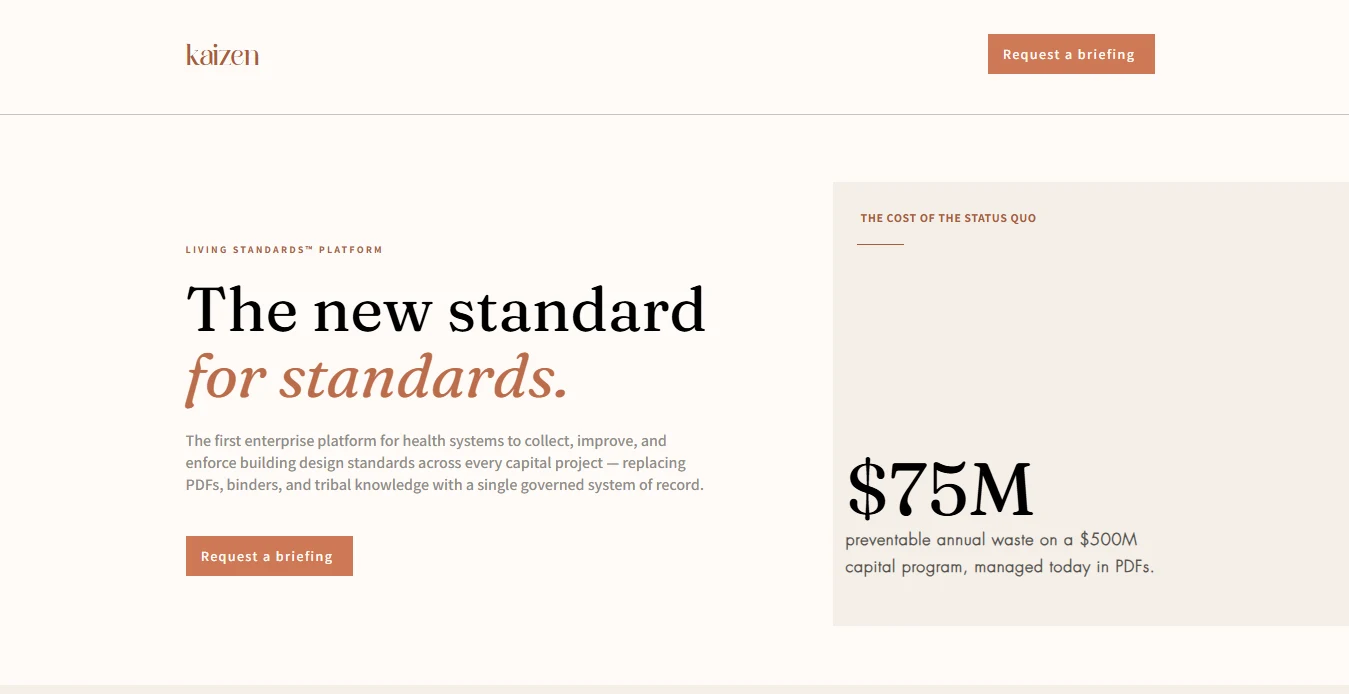
The first screen led with a large statistic instead of the software, so there was nothing to judge before booking.
Abstract words first
A coined term and the word “governance” opened the page. Concrete ideas like rework and change orders sat further down.
One path, little reassurance
A single button and no hint of what the briefing involves. A visitor not ready to book had nowhere to go.
What I changed
Show the product in the first scroll
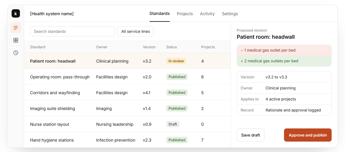
An app window under the headline: a table of standards with owner, version and status, and a proposed change shown as a before-and-after diff with an approval record.
Before. A statistic card filled the right side of the first screen.
Why. The visitor can see what the software does, so the briefing becomes a way to see more, not a leap of faith.
Name the category in plain words
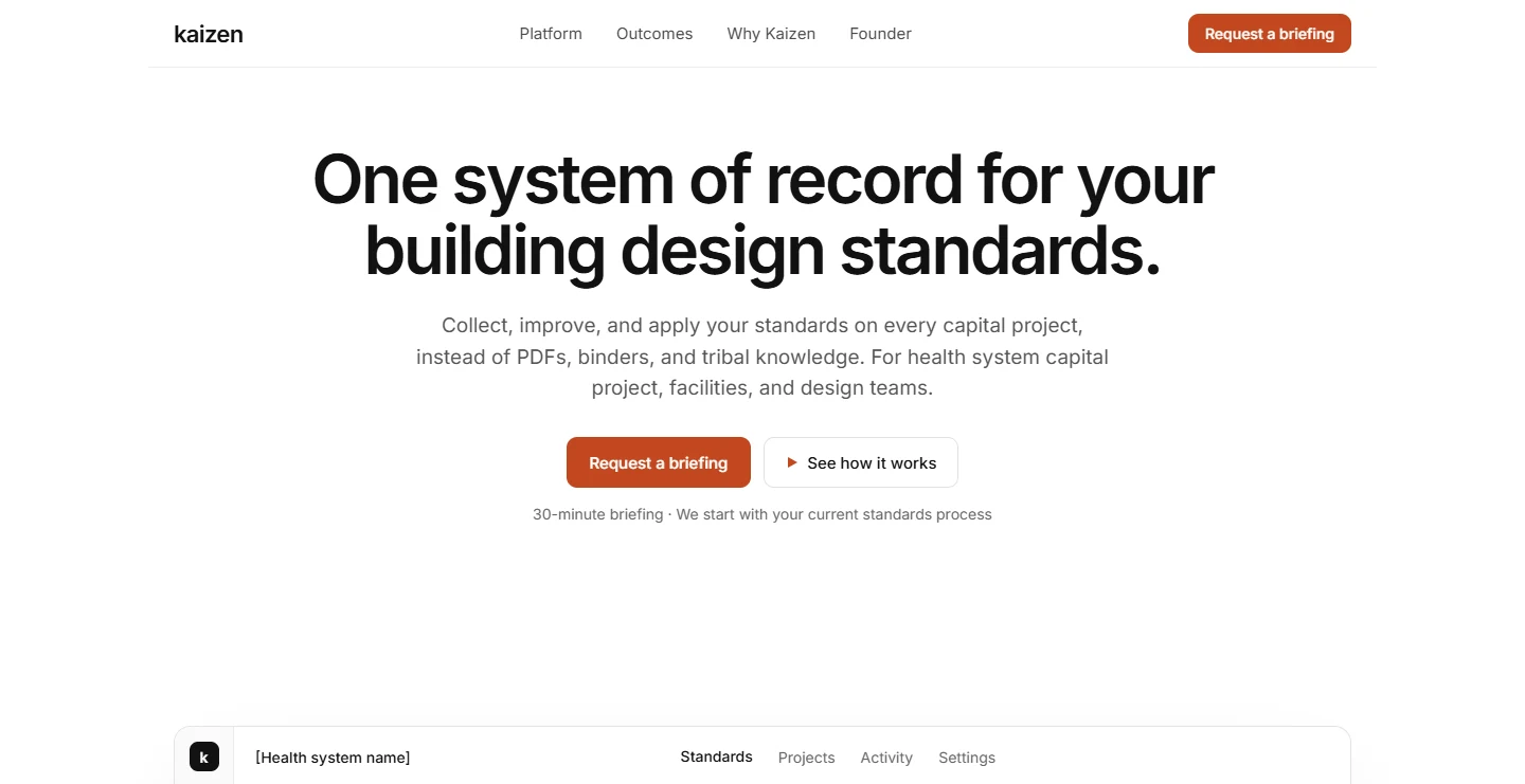
“One system of record for your building design standards,” with a subhead that names the old way (PDFs, binders, tribal knowledge) and who it is for.
Before. A memorable line built around a coined term.
Why. A stranger can say what it is and who it is for in about five seconds.
Two paths and a smaller first step
The same primary button, a quieter “See how it works”, and one line underneath: a 30-minute briefing that starts with your current standards process.
Before. One “Request a briefing” button.
Why. Visitors who are not ready to book have somewhere to go, and the ask is clear about its size.
A plainer look so the product carries the page
A white page, one sans-serif typeface and one accent colour, used for the action.
Before. A cream page with a serif headline and terracotta italics.
Why. Software that governs hospital standards should look as dependable as it claims to be.
What I kept
The same “Request a briefing” label in the nav and the hero.
Before. The page already told its story in a sensible order and used one button label throughout.
Why. That was already working, and changing it would add risk for no clear gain.
Same visitor, different answers
| The visitor asks | Before | After |
|---|---|---|
| What does it do? | A clever headline | A headline that names the job |
| What does it look like? | A stat card | The product, under the hero |
| Why should I trust it? | Unsourced figures | Trust logos and a clear next step |
What this should do for them
This is a concept, so there are no results yet. Here is what each change is meant to do, and where you would see it.
Visitors can see what they would be booking before they book.
You’d see it in more briefing requests from the first screen.
Visitors who are not ready to book have somewhere to go.
You’d see it in clicks on “See how it works”, and briefings booked afterwards.
Visitors can tell what the product is within a few seconds.
You’d see it in fewer people leaving at the first screen.
This is concept work, so there are no results to report. It redesigns Kaizen and is not affiliated with or endorsed by them. Nothing here has had real traffic.
Want this kind of teardown for your site?
Book a 20-minute call, or send me your website address for a free audit.
20-minute call · Fixed quote within one business day