Case Study
Blur It
Redesigning a marketing website to communicate real product value and build lasting trust.
Scroll
Redesigning a marketing website to communicate real product value and build lasting trust.
Blur It is a Chrome extension that helps people hide sensitive information while sharing their screen.
Although the product solved a genuine problem, I felt the original marketing website wasn't communicating that value as effectively as it could. The product felt more polished than the website presenting it, creating an opportunity to improve clarity, strengthen trust, and better reflect the quality of the product.
When I revisited the original website, I realized it was doing a good job explaining what Blur It did, but not why someone should trust it enough to pay for it.
The product solved a real problem, yet the website didn't create the same level of confidence. It felt more like an indie side project than a polished product, leaving an opportunity to improve how the product was perceived.
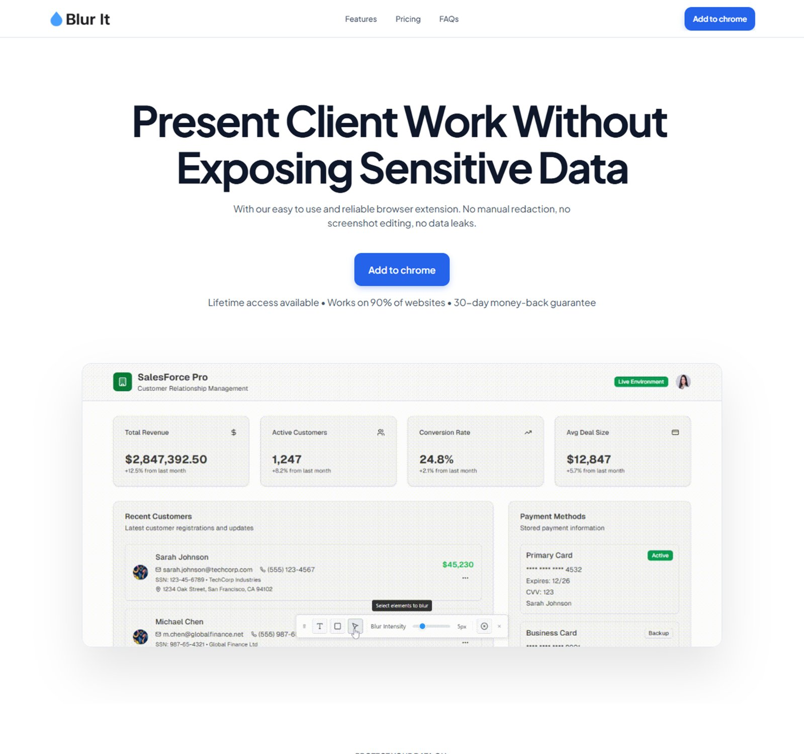
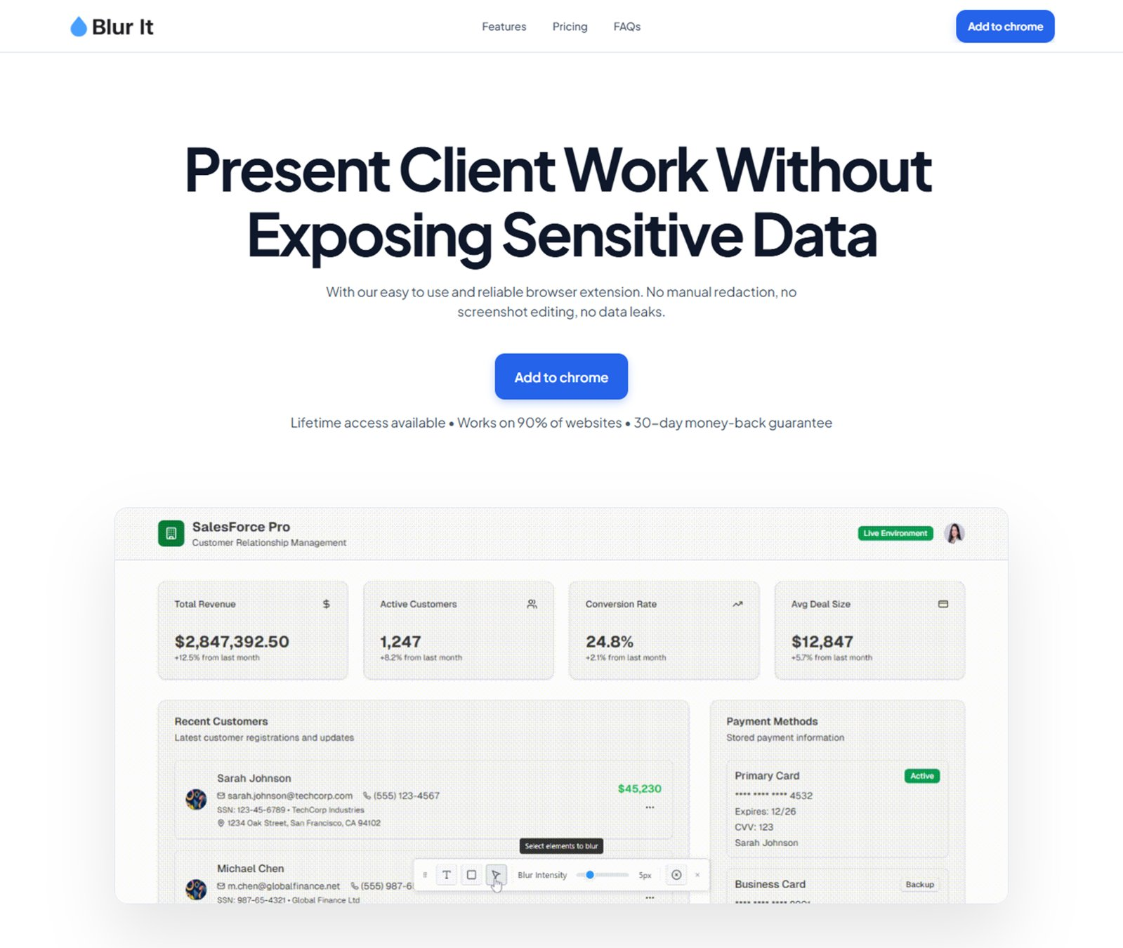
The website explained what the extension did, but didn't communicate why it mattered or the outcomes users cared about.
The extension felt polished, but the website didn't reflect that same level of quality or professionalism.
Most of the product was described through screenshots and copy rather than shown through interaction.
The purchasing experience presented unnecessary friction instead of keeping the focus on whether the product solved the user's problem.
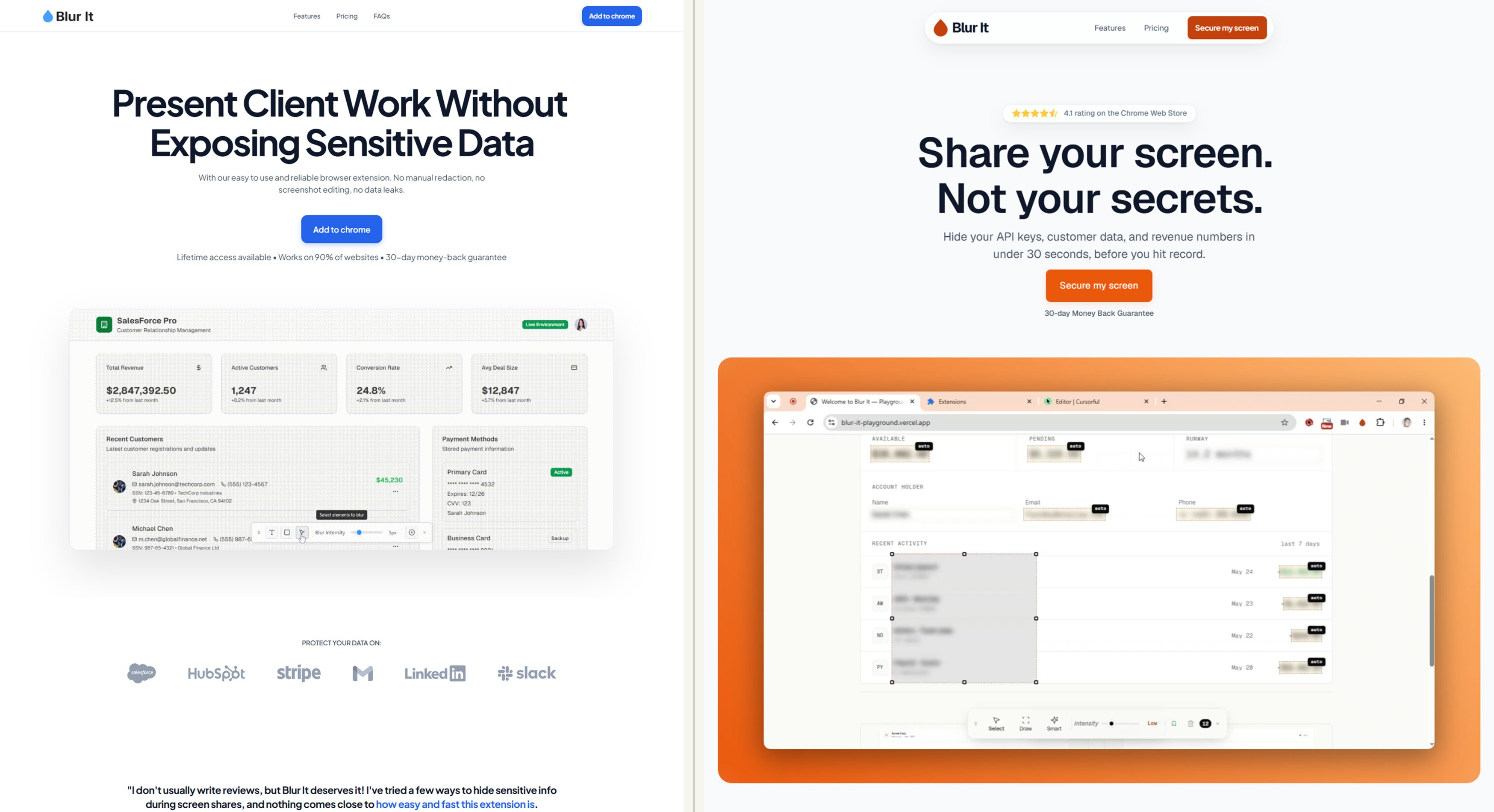 Before
After
View full comparison
Before
After
View full comparison
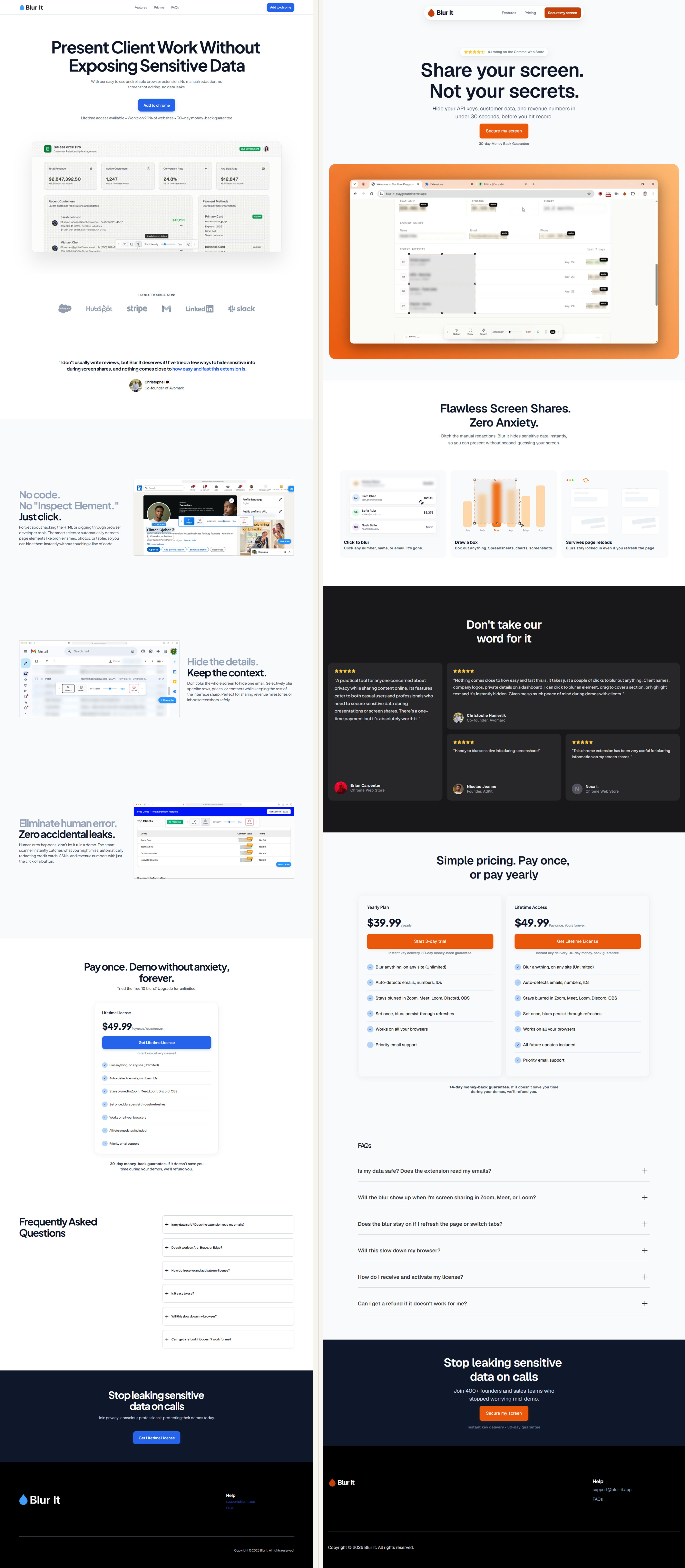
Rather than redesigning the website for the sake of aesthetics, I focused on making it a clearer representation of the product. The strategy centered around improving communication, increasing trust, and helping visitors experience the product before asking them to buy.
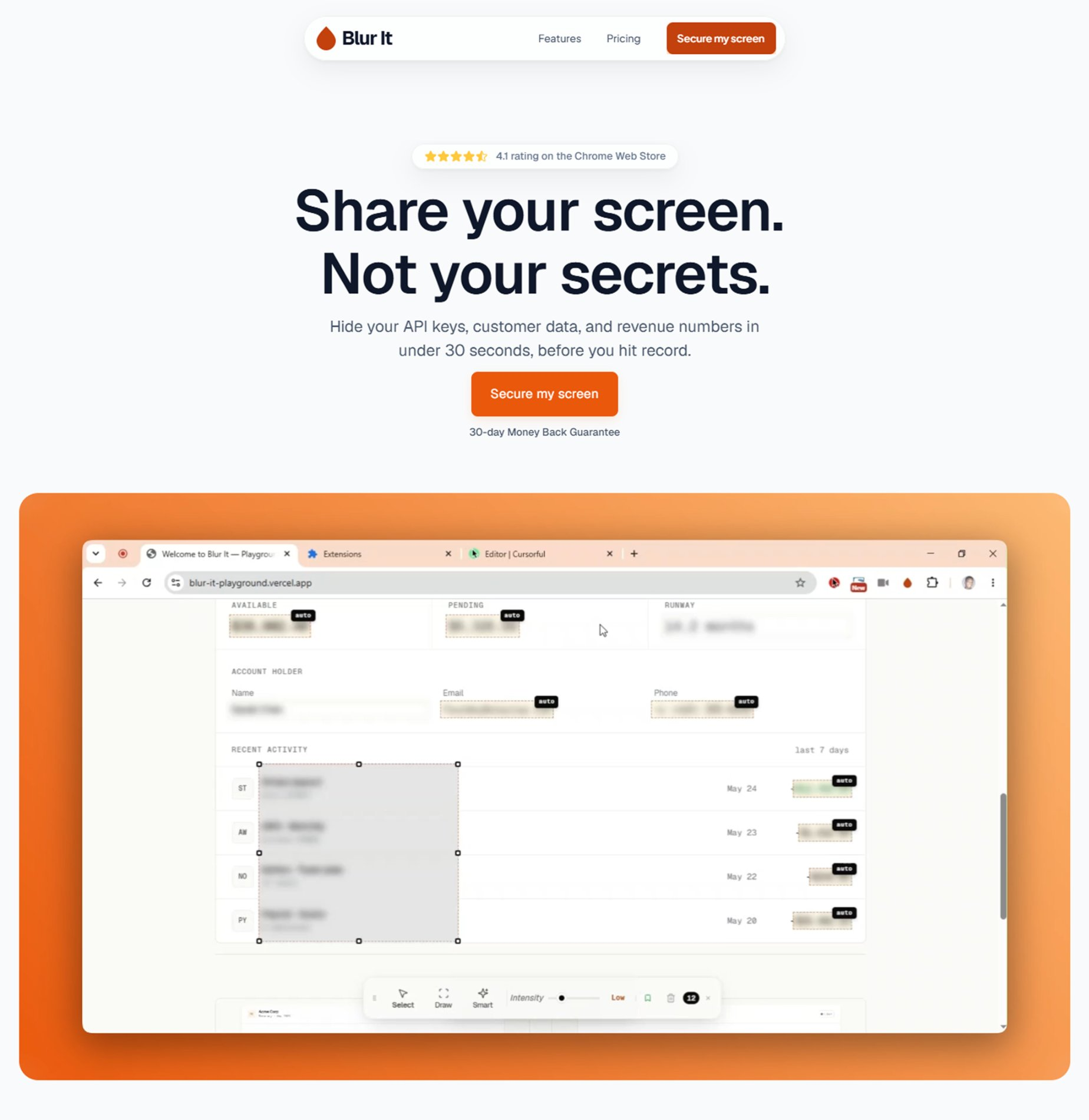
The original hero focused on what Blur It could do. The redesign reframed the messaging around why it matters, helping visitors understand the value of the product before introducing individual features.
Rather than describing the extension through static images, I used interactive demonstrations to let visitors understand the product through experience. This reduced cognitive effort while making the product feel more tangible.
Small design decisions collectively influence how trustworthy a product feels. A more consistent visual system, improved spacing, and stronger hierarchy helped the website better reflect the quality of the extension.
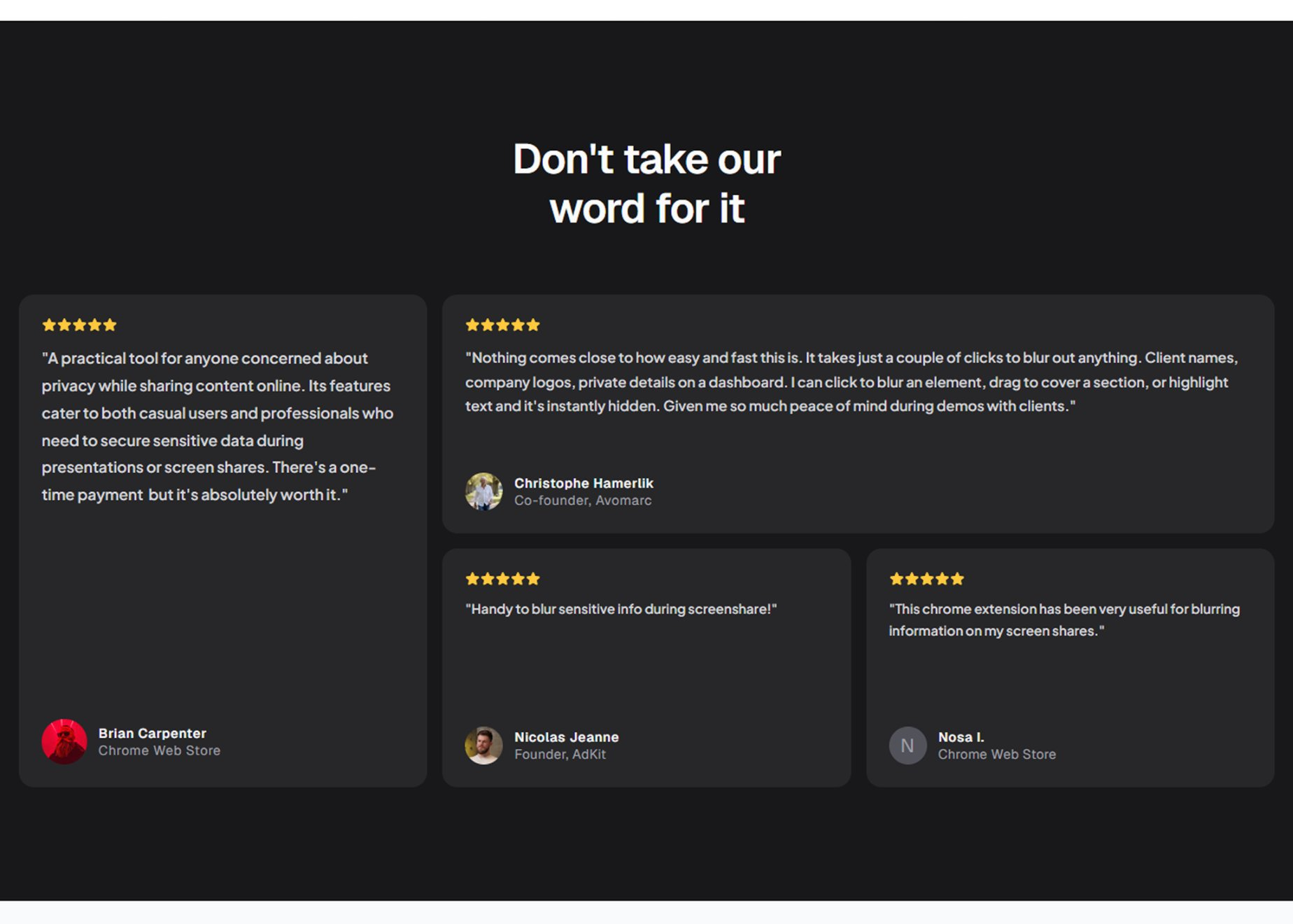
This project reinforced an idea I continue to come back to: a good marketing website isn't just visually appealing; it helps people understand the value of what they're looking at.
More importantly, it reminded me that trust is built through dozens of small decisions rather than one dramatic redesign. That's a mindset I now bring to every project.
If not, I'd love to help you uncover what's holding it back and redesign it to communicate more clearly, build trust, and leave a stronger first impression.